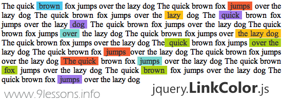
This post is explains how easy you can built a jQuery plugin, we made a simple plugin called LinkColor. It makes your website anchor links so colourful and pretty beautiful, Just few line of code and very simple to use. Follow the eight steps and learn how to create your own jquery plugin. Take a look the live demo. Thanks!
 Download Script
  Live Demo
jquery.LinkColor.js
/**
* jQuery LinkColor Plugin 1.0
*
* http://www.9lessons.info/
*
* Copyright (c) 2011 Arun Kumar Sekar
*/
(function($){
$.fn.LinkColors = function(){
//Link background colors
var colors = new Array('4AC7ED', 'FDC015', '9F78EC', 'F25C33');
return this.each(function(i,obj){
$this = $(this);
$anchors = $(obj).find("a").get();
$.each($anchors, function(j,ele){
var randColor = Math.floor ( Math.random() * colors.length );
$(ele).css({
'background-color':'#'+colors[randColor],
'text-decoration':'none',
'color':'#333333',
'padding':'0px 5px 0px 5px'
});
});
});
};
})(jQuery);
* jQuery LinkColor Plugin 1.0
*
* http://www.9lessons.info/
*
* Copyright (c) 2011 Arun Kumar Sekar
*/
(function($){
$.fn.LinkColors = function(){
//Link background colors
var colors = new Array('4AC7ED', 'FDC015', '9F78EC', 'F25C33');
return this.each(function(i,obj){
$this = $(this);
$anchors = $(obj).find("a").get();
$.each($anchors, function(j,ele){
var randColor = Math.floor ( Math.random() * colors.length );
$(ele).css({
'background-color':'#'+colors[randColor],
'text-decoration':'none',
'color':'#333333',
'padding':'0px 5px 0px 5px'
});
});
});
};
})(jQuery);
How to Use
...................
....Content...
...................
How to Develop a jQuery Plugin from Scratch.
Step 1(function($)
{
// --------------
})(jQuery);
{
// --------------
})(jQuery);
Step 2
fn is function identifier LinkColors is the plugin name.
$.fn.LinkColors = function()
{
// Plugin code ...
};
{
// Plugin code ...
};
Step 3
Initiating colors variables. You can add some more colors here based on your template color combinations.
var colors = new Array('4AC7ED', 'FDC015', '9F78EC', 'F25C33');
Step 4
Here this refers to selectors. You should use always each function, selectors may be more than one.
return this.each(function(i,obj)
{
//............
});
Step 5{
//............
});
Finding anchors from selectors Eg, body, #divName and .className .
$anchors = $(obj).find("a").get();
Step 6
Loop available anchors
$.each($anchors, function(j,ele)
{
//.............
});
Step 7{
//.............
});
Make a random keys from colors array
var randColor = Math.floor ( Math.random() * colors.length );
Step 8
Applying CSS style for anchor each obj
$(ele).css({
'background-color':'#'+colors[randColor],
'text-decoration':'none',
'color':'#333333',
'padding':'0px 5px 0px 5px'
});
'background-color':'#'+colors[randColor],
'text-decoration':'none',
'color':'#333333',
'padding':'0px 5px 0px 5px'
});


